Creating an adaptive identity system for the Melbourne Recital Centre

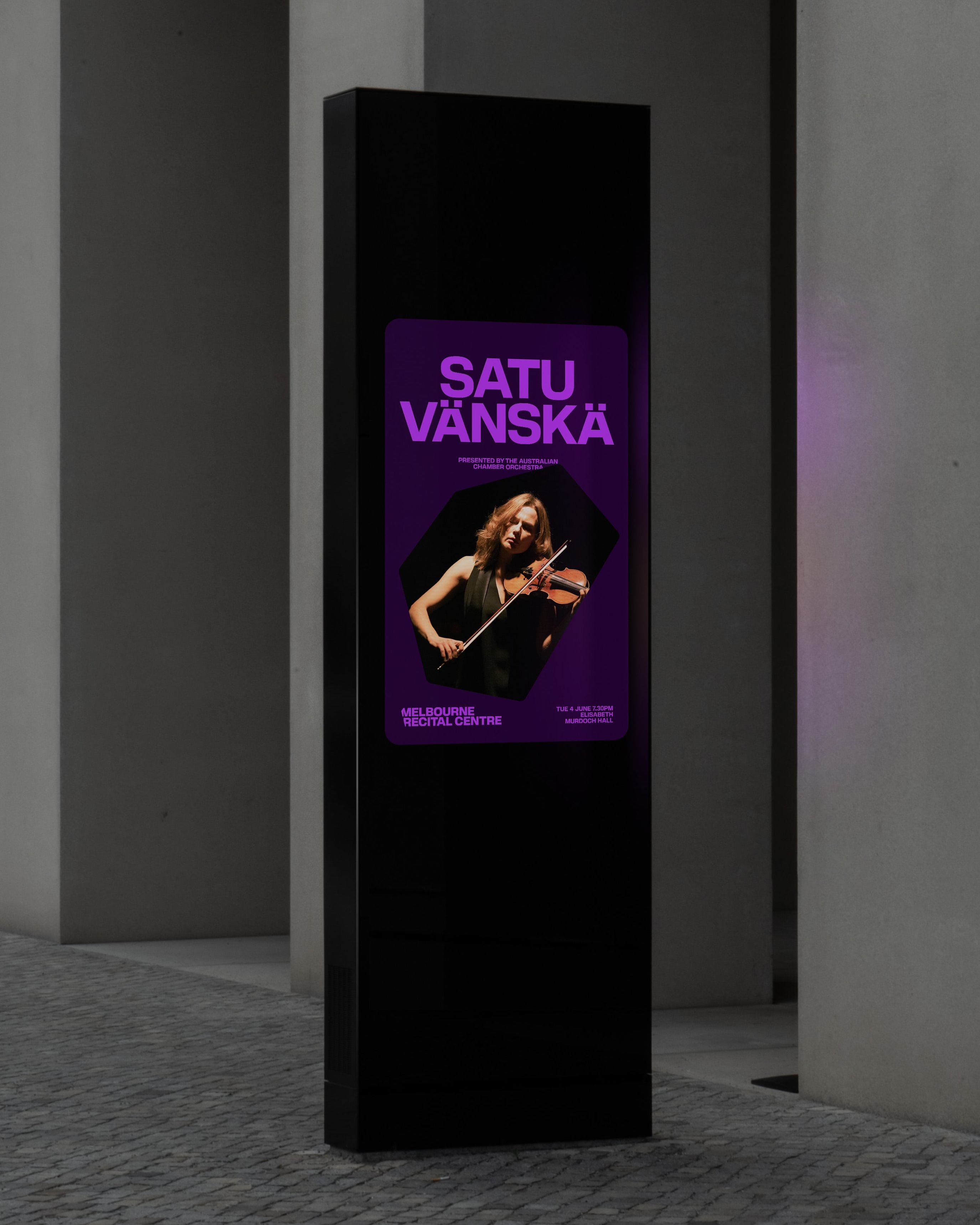
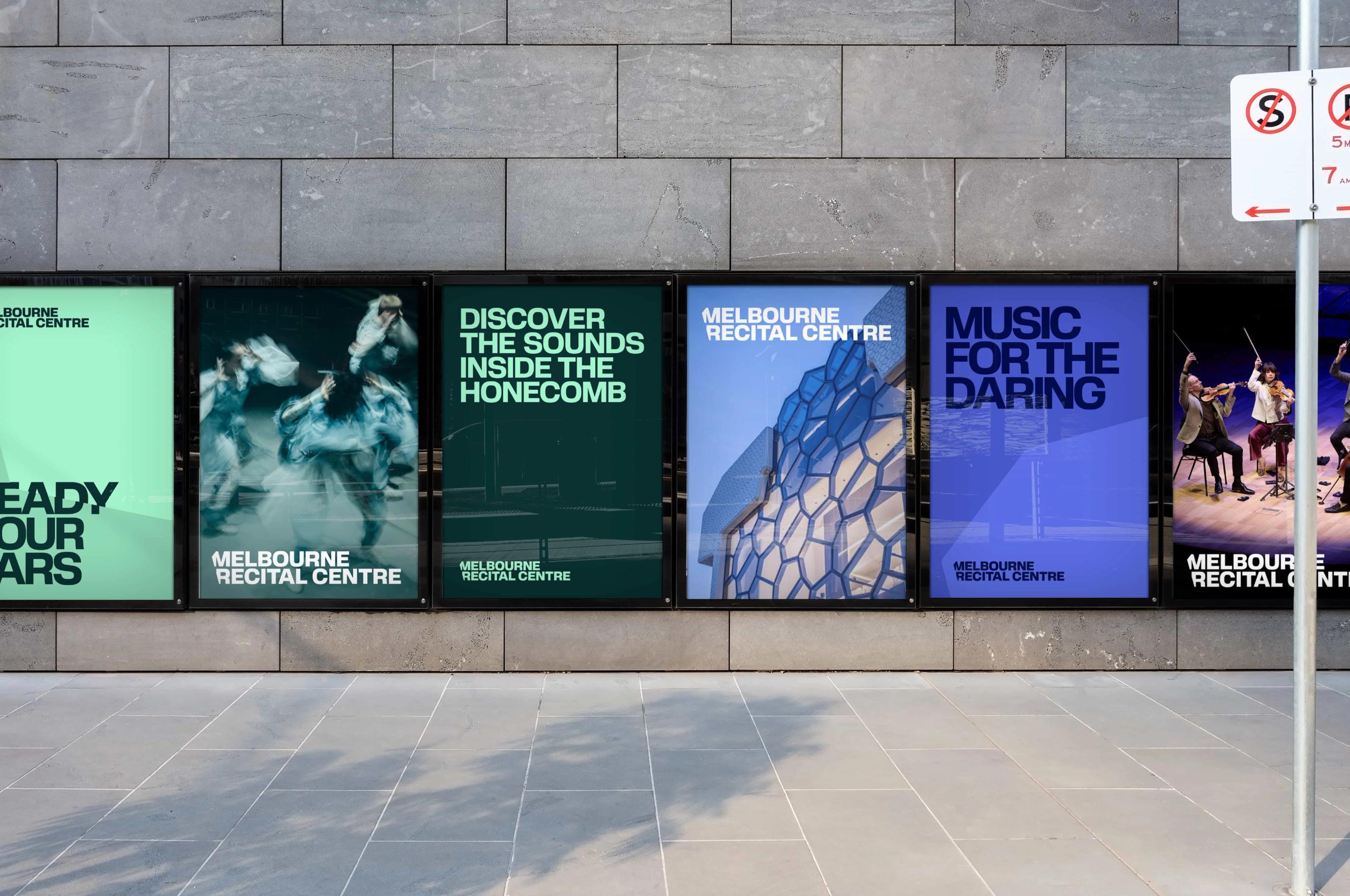
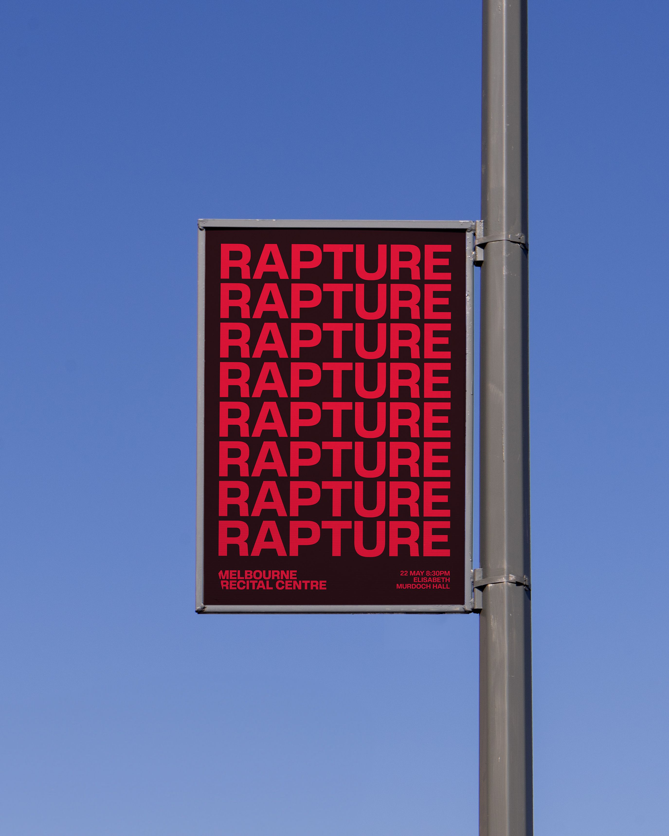
MRC plays host to many types of events, from global touring acts to first time performers. Our goal was to produce a brand system that would apply equitably to all artists.

To achieve this, we built a colour picker tool, that allows for an artists image or headshot to be upload, and a pair of colours to be generated as their signature palette. These colours get adjusted to ensure contrast accessibility, and lifted to a specified saturation range to match the recital centre's brand tone.

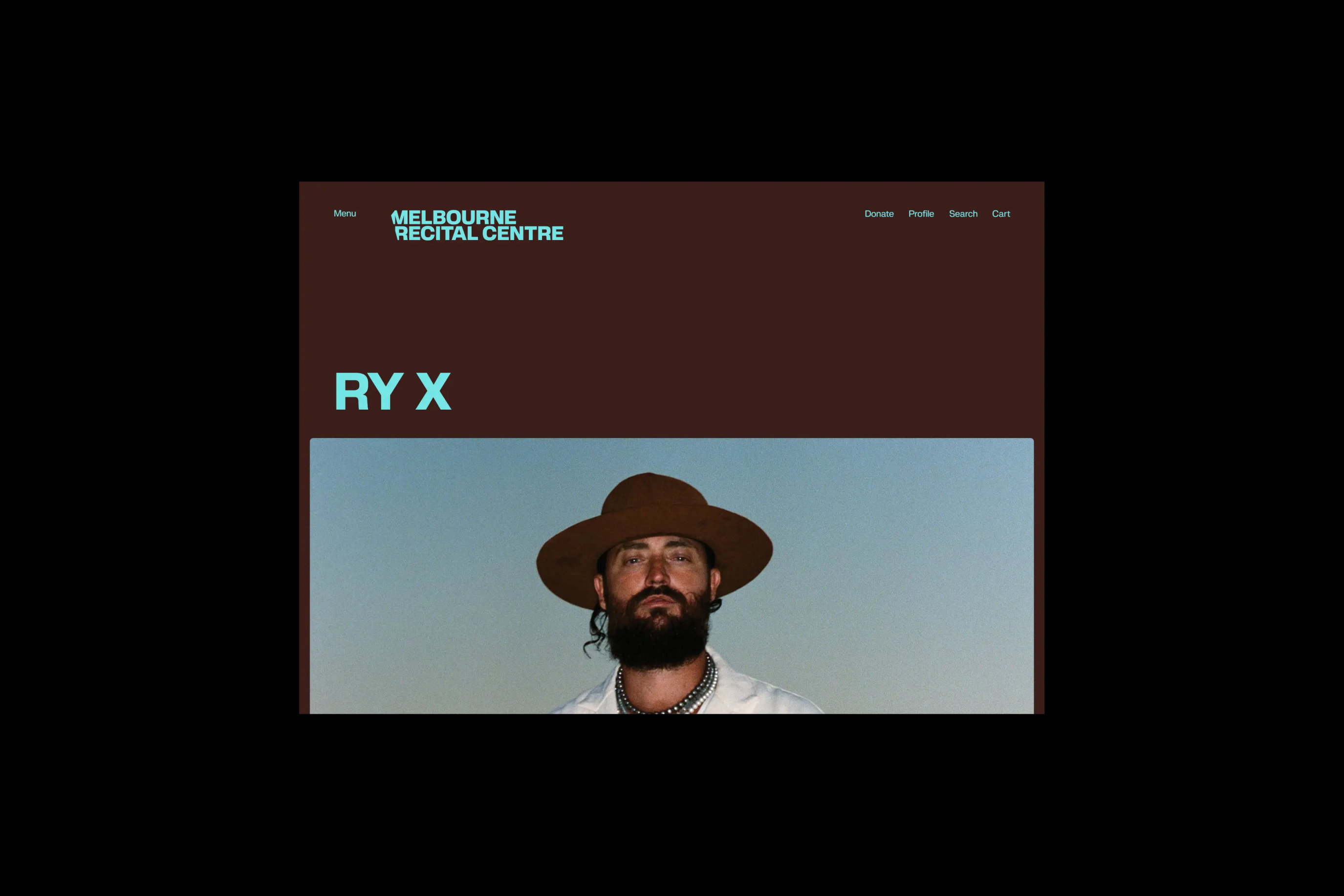
Working with Ultra Kuhl , we developed a custom version of Porteron as our typeface. Our modifications allowed us to preserve our tightly set typographic style by adjusting characters so their accents and umlauts fit within the cap height of the letterforms.

Melbourne's best acoustic music venue. The Melbourne Recital Centre, placed in the heart of the city’s art precinct, is renowned intimate concert hall, and rich resonate acoustics. Despite its devoted supporters, prime location and diverse programming, the MRC has struggled to shake its "classical-only" reputation, and engage a wider audience.

Tasked to thread the needle - attracting new patrons while strengthen existing - we worked closely with the MRC team and stakeholders to navigate repositioning and rebranding the centre.

With the team, we developed the strategic positioning of "Music for the daring" - as an invitation to new patrons, and a pioneering ethos for the centre to adopt. This helped direct the rebranding towards a 'bold' new identity – leaning on strong typography and colour to refresh all brand touch points.

  • Services
  • Branding
  • Positioning
  • Animation
  • Brand tools
  • Digital guidelines
  • Creative technology
  • Credits
  • Studio MASS, Agency
  • Melbourne Recital Centre, Client
  • Ultra Kuhl, Foundry
  • Tom Marley, Drone footage
  • Artist imagery © the original artists