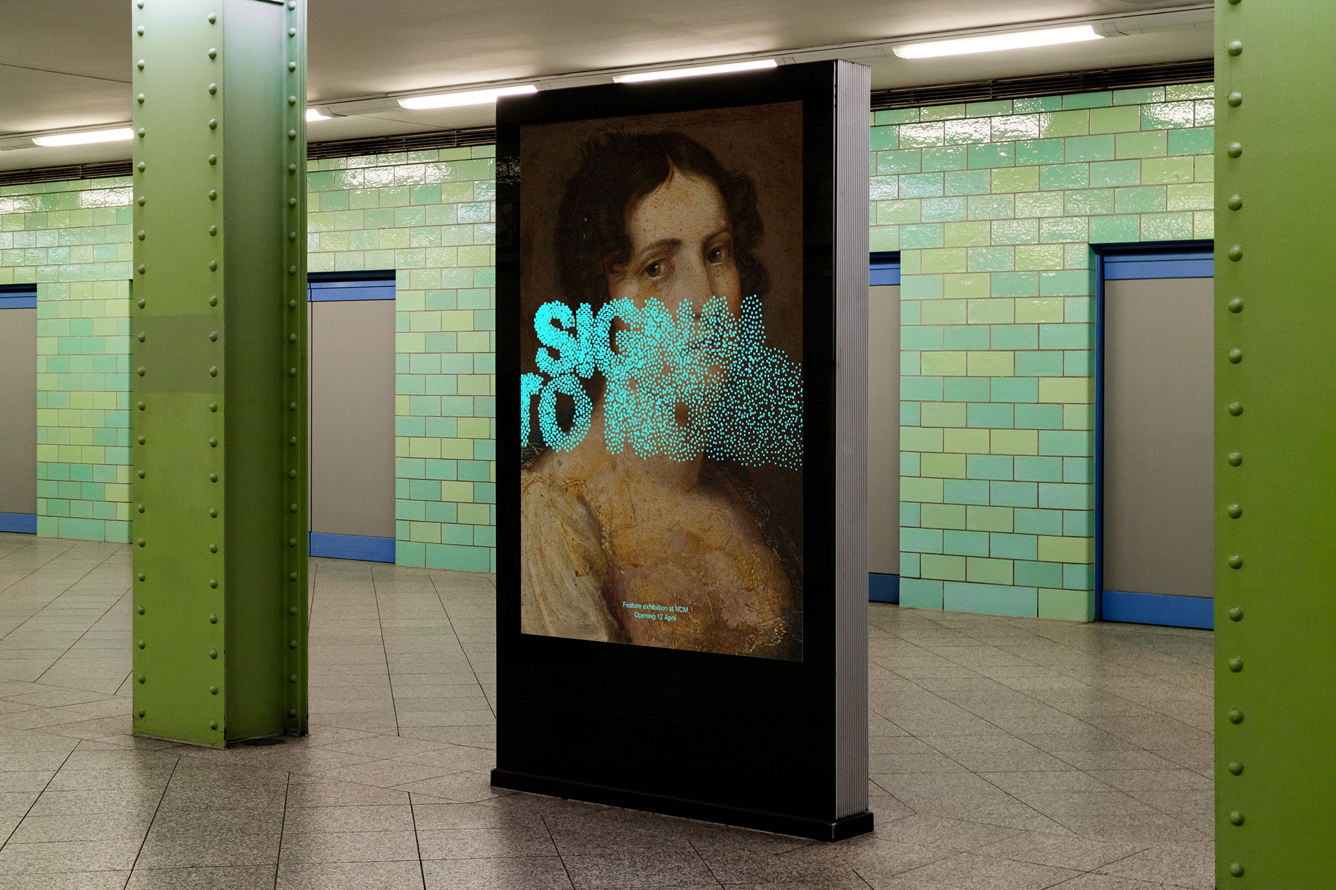
Newcastle Art Gallery is undergoing its biggest transformation yet, doubling in size, expanding its collection, and reopening with a $40 million redevelopment. As the renovation took shape, the team wanted a brand that would match this new chapter: one that captured the character of Newcastle while reflecting the gallery’s growing national and international presence.
Our role was to take their newly designed logo and build a cohesive brand system around it, covering colour, typography, motion, posters, and more. We also redesigned the website so it sat naturally alongside the new identity, carrying the same clarity and confidence across both physical and digital spaces.
The brand’s colour palette drew from Newcastle’s industrial heritage as a coal-exporting port and centre for steel refining: white for gallery walls, black for coal, and silver for steel. In print, silver appeared as foils and gradients; online, it became a dynamic reflective gesture. To tie everything back to the new identity, we created an asymmetrical grid derived from the logo itself - applied consistently across all digital and print to give the brand a strong, connected presence at every touchpoint.


